
We’re doing some quick changes now but will continue to keep a close eye on the state of the game during next week. Read more »

We’re doing some quick changes now but will continue to keep a close eye on the state of the game during next week. Read more »
Patch 0.11.2.0 will arrive tomorrow, Thursday, March 23rd, at 15:00 CET (7 AM PDT / 10 AM EDT). During the patching process the servers will be down, and the whole process will take up to 1 hour.
This patch is very all-encompassing. With every champion getting increased movement speed and tweaks to keep up with the new pace, as well as a few champions getting major changes both to their primary attacks and Battlerite trees, the complete effects of this patch are unknown even to us. We hope that you find as much joy as we do in exploring this new patch and figuring out the new meta! Read more »
Katey here!
What’s happening in Stunlock town?
Well as you know, there’s been a lot of fiddling and tweaking for Patch 0.11.2.0, which we’re all pretty excited about (but also, admittedly, a teeny bit anxious for). The game designers and co have been busy on the core gameplay changes, playing it with testers, getting feedback etc. The patch date was already announced last Friday and I can confirm it will go live this Thursday.
I took part in testing the new patch and it’s been quite an experience so far. Initially, the purpose of the patch was to create more interesting and dynamic play via movement speed changes and changes to M1 ranged abilities. The goal was to get more dodging and interesting plays in neutral situations, allowing for more outplays via skill.

Nous savons que vous êtes tous intrigués par les changements des attaques M1; nous n’aurons malheureusement pas la possibilité de vous délivrer la mise à jour cette semaine, mais nous serons cependant en mesure de vous donner une date précise pour cette mise à jour avant la fin de cette dernière. Restez à l’écoute! Nous vous proposons, pour patienter un peu, le blog de Tau Petersson (notre responsable des événements) montrant les coulisses des IEM Katowice!
Hey !
Ici vous pourrez voir la part de ma vie consistant à me rendre à différents événements pour présenter Battlerite ou encore Stunlock. Cette fois nous avons eu la chance de nous rendre à l’IEM Katowice pour discuter un peu avec Razer et jouer à Battlerite sur leur stand. Pour m’accompagner j’avais deux de nos plus brillants éléments : Levox (Jens Bak) et Silfver (Christoffer Silfverswärd)
 Bienvenue. Aujourd’hui, je serais votre guide à travers le monde magique de l’e-sport. Mon nom est Alexander et je travaille comme manager e-sport chez Stunlock Studios, mais certains d’entre vous me connaissent peut-être sous le nom de GrimGoon.
Pendant ce voyage, merci de rester assis. A gauche, nous avons des dramas exagérés et à droite, nous avons des égos surdimensionnés.
Read more »

C’est encore moi ! Au cas où vous auriez manqué le premier dev-blog, je vais me présenter encore une fois. Mon nom est Katey et je suis chargée du design de l’interface utilisateur ainsi que du marketing chez Stunlock Studios. Mon post va se concentrer sur ce qui s’est passé la semaine passée.
En raison du tournoi « Enter the Arena »de ce week-end, nous avions prévu d’avoir quelques posts e-sports écrits par le seul et unique GrimGoon (manager e-sport), mais comme l’organisation d’un tournoi est très chronophage, nous n’avons pas été en mesure de poster tout ça cette semaine. Nous espérons pouvoir vous poster ça dans peu de temps.
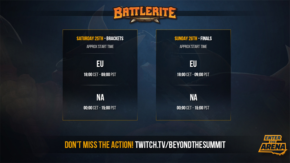
To kick off the 2017 competitive season in style, Battlerite is pulling out the big guns as it partners with Beyond the Summit and Twitch to bring you “Enter the Arena”.
The event starts at approx 18:00 CET / 09:00 PST this Saturday and Sunday over at Beyond the Summit on Twitch.tv.
This weekend sixteen of the best teams from North America and Europe will collide in an epic showdown with lots at stake. Not just the record setting purse of 10,000 USD hangs in the balance, but also honor and regional bragging rights. Who will make it through? Who will collapse under pressure? And will the top seeds from the invitational process in TelroskMi and Onslaught live up to the billing?
Vous pouvez voir un teaser et une explication des changements M1 à venir ici.
Le patch 0.11.1.0 est prévu pour le 28 Février et contiendra des corrections de bugs ainsi que des mises à jours de certains champions. Les serveurs fermeront à 15h00 CET et la maintenance durera environ une heure.
Le changement des compétences M1 originellement prévu pour ce patch a été reporté. Il ne sortirat pas avant un minimum de 2 semaines car un de nos collaborateurs a été absent pendant près d’un mois.
Nous souhaitons vous tenir informer de ces changements le plus rapidement possible. De ce fait, nous allons vous proposer un aperçu de ces nouvelles fonctionnalités dans le dev-blog à paraître lundi.
Nous nous excusons auprès de la communauté pour ce retard. Ces changements de gameplay sont notre priorité actuelle et l’équipe de développement travaille dur pour améliorer votre expérience de jeu sur Battlerite sur de prochains patchs.

Le scorpion Empereur (A gauche) sera valable pour les gagnants de certains tournois. Le scorpion Deathstalker pourra être obtenu via des giveaways.
Welcome Battlerite fans!
My name is Konrad Petersson (IGN: Krab) and I’m a Technical Game Designer. I started working here at Stunlock Studios (SLS for short) November 2016, and to be honest, I have loved every minute of it. My main focus has been designing and implementing new champions for Battlerite together with the rest of the Champion team. I also do stuff like fixing bugs, analyze and balance the game together with the rest of the Design team.
This is my very first dev blog post and as many of you might have figured out already, it’s about the making of our latest champion, “Raigon, the Exiled prince”. I will go through our initial goals, how we have iterated upon the concept, bumps along the road and decisions on the way to final product (if you could ever call a champion in a multiplayer game final!) from the perspective of a designer. Hopefully it will provide you with some juicy insight on how the champion creation process works!
With each champion we make, we want to improve the Battlerite roster as a whole. We have a lot of potential champion designs and art concepts lying around, which sometimes makes it hard to pick what to go with next. Creating design concepts and abilities is in many ways a creative outlet, but first and foremost, we try to identify what our current roster would benefit the most from. At the same time, we see great value in introducing new and unique abilities to the game as a whole, and try to not limit ourselves idea-wise. Ultimately, if it works in the game, it can potentially make the cut.
We wanted our next Champion to be:
Coupled with the general design directions of Battlerite, such as making every champion unique in the way they play, fill their own role and fit into the game, this is usually how defined a champion is from the start.
The Stunlock Studios Champion Team consists of Game Designers, Artists (Sound, 2D/3D art, Animators, VFX) and programmers. The team works closely together based on the original concept. We communicate regularly through messaging apps and Champion Meetings where we meet, goof around, go through the champion’s current state both visually and mechanically, discuss what to improve, introduce new ideas and plan ahead.
We decided we wanted to make a two-handed sword fighter. We had none of those and it would fit in well with the “Broad Appeal” direction we wanted to take. Fans of BLC might notice the similarities between “Raigon” and fellow two-handed sword fighter “Reaver” from Bloodline Champions. We took some inspiration from “Reaver”, but ultimately, we wanted to find something new and unique that would fit our directions. Our 2D artists presented us with some awesome concept art and prototyping began from there.
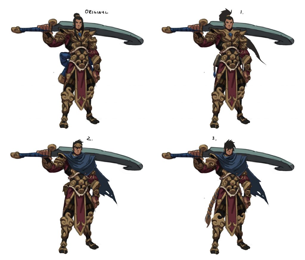
One of the first design decisions on Raigon’s abilities was to include a core mechanic that would grant him life back, allowing him to stay on and pressure his targets and sustain himself.
Our definition of “Beginner friendly” meant conveying a clear goal to players, rather than just making him a “simple” or “easy” champion to play.
Croak, for example, requires a bit more decision-making (as in jumping in and out to be effective) and is thus harder to learn to the point where the player is comfortable bringing him into competitive play. That being said, we are always working with skill ceilings and viability in mind, so the goal for Raigon would be easy to learn – difficult to master.
We also wanted new players, who might be starting out with Raigon, to learn some more of the common mechanics found in Battlerite. This would allow these newer players to carry on some knowledge from Raigon to their next champion of choice. Read more »
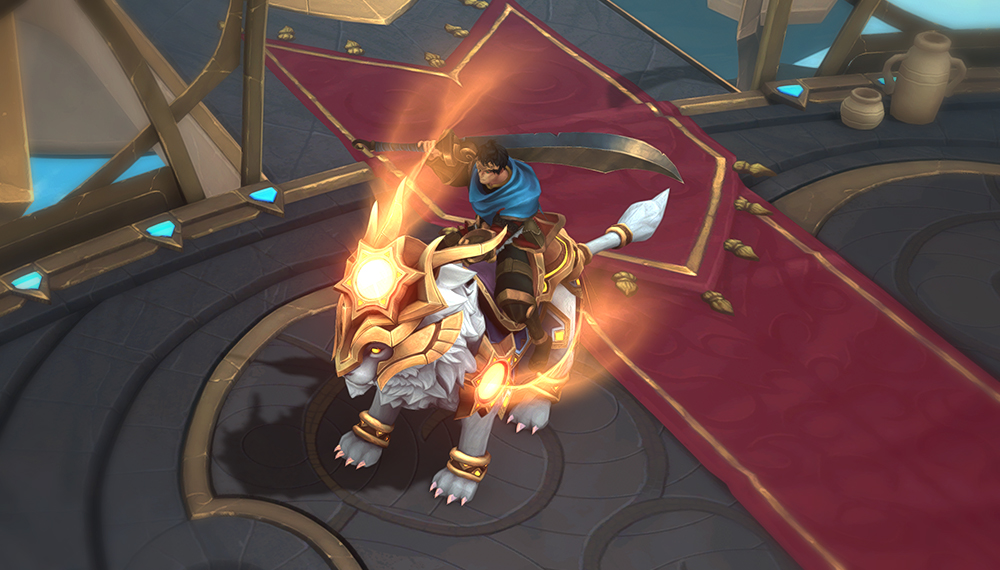
Congratulations to you, Grand Champions among Grand Champions! Enjoy your titles!