Hello and welcome to another Dev Blog!
My name is Katey and if you didn’t already know, I am the UI designer here at Battlerite. This week I’m here to talk about the new UI and why we designed it – and give you a sneak peek!
Why did we decide to make a new UI?
Earlier this year we were approached by Microsoft to make a console port of Battlerite to Xbox One, which started the conversation of what to do with the UI. We needed to make the UI console friendly, cross-platform ready, and more flexible and easy to port for the future. The old UI technology was not fantastic. The ‘UI core’ (as referred to by the programmers) was scary to touch and liable to break the entire system if we changed things. It was annoying to make amendments to the main menu (like the play menu) or add new game modes and it took too long for new programmers to learn how it worked.
Another factor is that the visuals of the old UI are pretty gloomy. We could never figure out exactly what to do with the scene that the champions sit in.
It felt empty, it had no context to it, and it’s also quite dark in the menus (originally this was to resonate more with the Bloodline Champion style). But by the time Early Access came we had changed our logo and updated our branding. The new vision of branding was to be bright, fresh, modern, and inviting with a memorable, easy-to-read logo that had suggestions of competitiveness. We ended up using a large arena background image behind the logo in many cases, and it felt fitting.
![]()
This game is about PvP in an arena, and we want to give off these vibes by just glancing at the logo.
When we asked users in testing what they thought the game they were about to play was with the old UI we got extremely varying results – and not one person answered “team-based pvp competitive multiplayer” or anything along those lines. The old UI art style didn’t match up – it’s atmospheric, almost RPG-like, and told the wrong story to the players from the initial start up of the game. We knew we were communicating the wrong impression from the menus alone.
So – what if we could solve all of these problems and at the same time implement and support the many quality of life improvements that were being asked about? It’s a win-win.
When we started it was basically just me and one programmer doing early tests and prototypes, trying out things and trying to figure what kind of main menu system could support all the things we wanted to support.
Here’s some very early messing around, we used these images as discussion points: what does the design limit us to, and what opportunities does it create?

We discussed every problem and strength we could think of and finally decided that we needed:
- A main menu that you could use the LB and RB triggers to scroll through
- A way to support more than one news point on the main page that we could easily update
There are so many things we want to highlight for our players that we couldn’t go for the Heroes of the Storm approach where they only highlight a maximum of three things and they’re mostly store related. We want to highlight things which help our community grow and help players get involved with each other.
This is where the landing page came in. We had this great vision to create a landing page that had posts we could control via a website. We made the tech and we even teased about this in an earlier dev blog. Trouble was we didn’t have enough people who had time in the community team to keep this up to date, and once we started implementing it further we ran into some technical issues with the server that became a blocker for the feature.
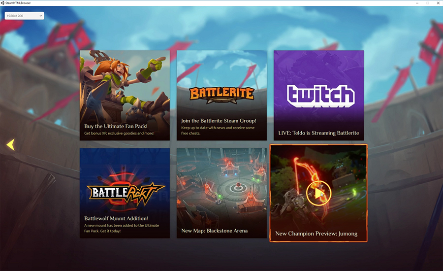
However, it wasn’t a wasted effort. We finally got this clever technology working and we’re using it to support the new landing page (which is called Home) in the new UI. We also have Liz (who’s the best) to take care of community tasks so that Chris can focus 100% on game design, hooray!
So why have boxes with a top menu? A lot of people have already commented that it looks very ‘Windows 10’. I guess the tiled boxes remind people a lot of Windows 10 and on that platform it felt quite clunky to use. I don’t think using boxes guarantees that your UI is going to feel clunky though. I mean, most user interfaces are made of boxes, it’s just how you ‘hide’ them or make the experience feel. If you look at a lot of games that support both PC and console (and that don’t switch UI too heavily between the two), you’ll notice boxes are a quite common affair.
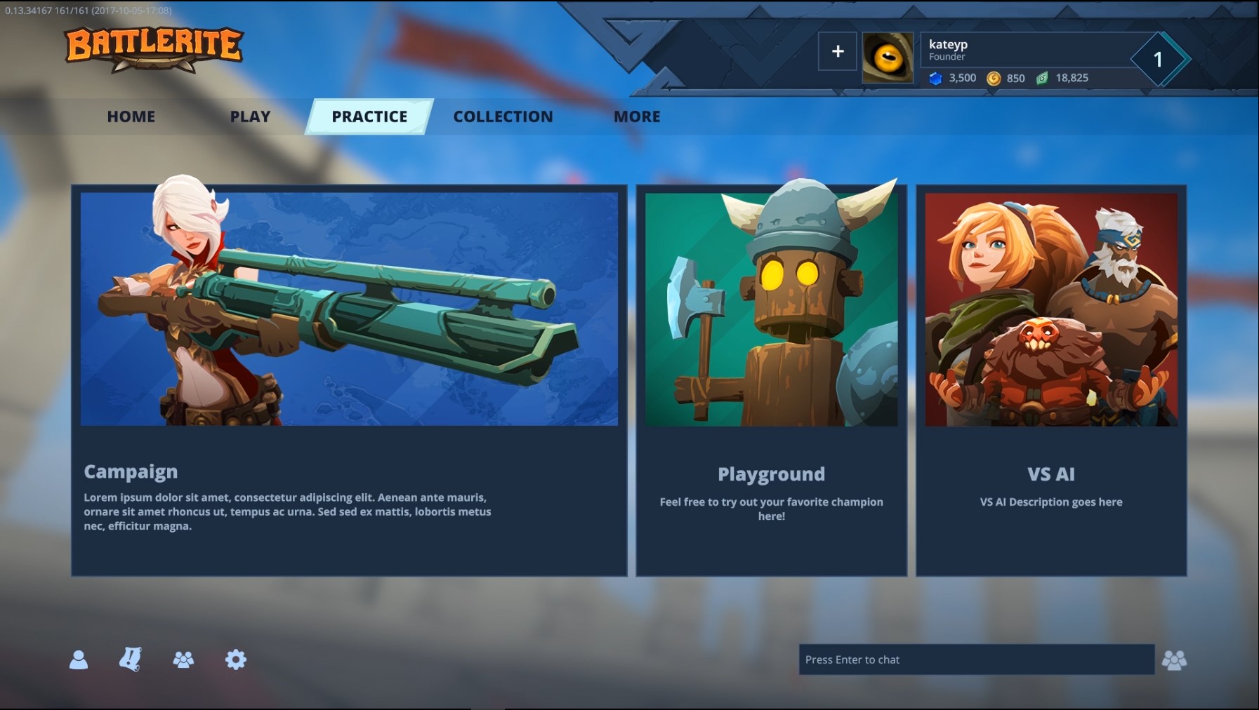
The main reason we’ve done this is because one of our main goals we’re adhering to when making the new UI is scalability. It’s super important to us that we can switch out content, add new content, add more game modes, or add more tabs so that we have lots of room to grow into our game. We also didn’t have a lot of time or programmers, so we couldn’t make some awesome menu navigation control like Destiny. We need to go for the tried and tested method – boxes which can easily link to larger areas or more boxes/options. These boxes allow us to explain content, provide visual branding to help communicate what things are (which is utterly missing in the old UI), and even has space for lobby status text.
What are the goals of the new UI?
We see the new UI as the beginning and most definitely not the end. I briefly mentioned goals, and that’s something I’ve tried very hard to stick to in order to guide my direction. Our main goals are:
- Scalability; every screen must have room for ideas we already have as well as ideas we don’t have. That might be why some screens feel a little ‘empty’ right now. We’re simply avoiding trapping ourselves into a corner.
- Appeal to the new branding goals: brighter, appealing, action-orientated (as opposed to an atmosphere that could be confused with an RPG), Battlerite-tribal-esque, and a competitive PvP feel with the arena.
- Cross platform ready – no designing screens that we have to heavily change to accommodate Xbox and other platforms we may port to in the future.
- Goes without saying that the new UI needed to be intuitive, that a new user could find everything they need by figuring it out on their own.
What are the new things and what have we tried to improve?
There’s so many things we wanted to include in the new UI but the fact that we were moving to a Free to Play model took presidency. Yes, we want better social systems, a better scoreboard, the list goes on and on. But what do we need right now at the Free to Play launch? Free to Play means we rely entirely on the profits of players buying gems and loot packs for us to grow the game. It would be kind of crazy then to not improve ways for us to sell items and enhance the desire for having cosmetics in some way.
We’ve tackled this in a couple of ways:
- Improved chest opening
We added a secondary anticipation stage so you can view what rarity items are before finding out what they are, which hopefully makes opening chests more fun and exciting. - Added a collection
So you can overview everything you own and don’t own. - Provided collection completion stats
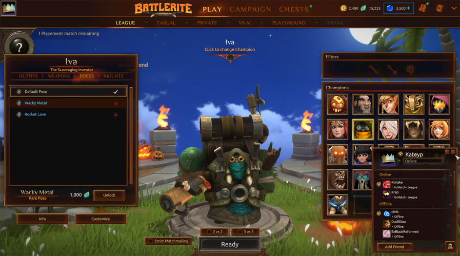
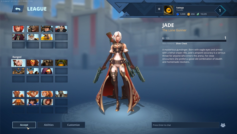
In the profile and collection we added stats that tell you how complete your collection is for the completionists out there that appreciate this sort of thing. - Created a 3D scene
Champions and their cosmetics are easier to see, in better lighting, and overall look more appealing. - Added support for color variations of items
Players have more colors to choose from and we have room to release more items without it seeming like we’re pretending it’s a new model.
With the main Free to Play stuff done, what else was the most important? We knew we had to support every feature players already currently enjoy if we could. This has been quite difficult because of how we essentially rebuilt the entire UI. We needed to make it easy for game designers to be able to experiment with game modes without us having to make highly customized lobbies every time (like the brawls we’ve done in the past). That is the main reason why you can no longer see your friend’s Champion models in the lobby. We prioritised being able to develop more game modes more quickly over seeing your teammates 3D model. The great news is you can check out other champions and their cosmetics whilst queuing! You can also equip a mount per champion! Nice.
But wait, there’s more:
Improved friends list
The new social menu enables you to sort through your friends easily, so inviting friends to a group (and private) should be easier than ever. We also added a tab so that you can see your teams. In the future we plan to improve this by being able to view team profiles, which may include statistics. We also want to have it so that if your entire team is online, you can invite everyone in that team with one click.
Customize your binds per champion
You can now bind keys per champion which should make it easier to make the controls more personalized for what works for you the best.
No placeholder art (famous last words)
We’ve worked hard on making sure that there is no old Bloodline Champion art used as confusing placeholders in abilities. We may have missed some at initial release, but we will do our best to make the UI as polished as possible for F2P launch.
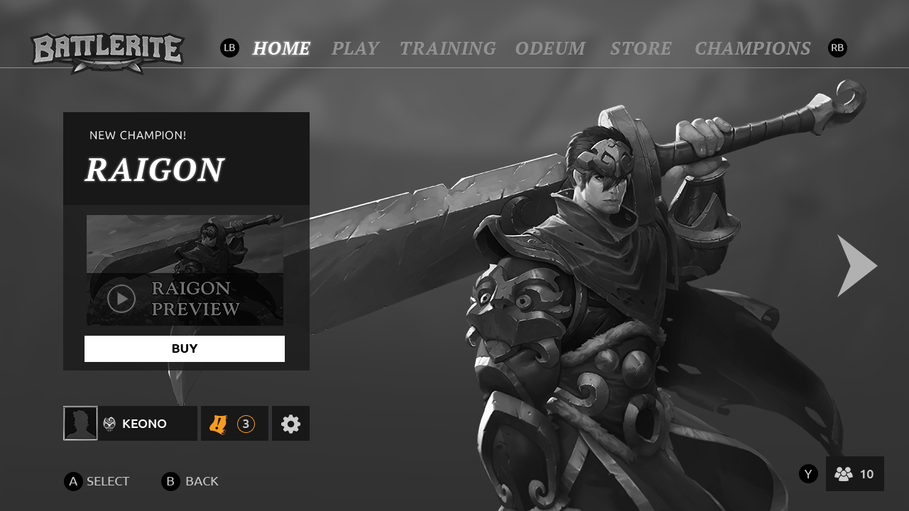
New art
We have new Battlerites card art (only supported in the menu so far), new quest art, new achievements art, new League icons, and new game mode art.
New chat
The new chat is still being polished and it may be a little buggy to begin with, but it does support whisper commands and lots of other small quality of life improvements. It does not support group/clan/global chat of any kind, but it does have the room to have group chatting in the future. This won’t be the last update to the chat!
New sound
We hired a freelance sound designer and he’s been working really closely with us on creating a brand new soundscape for the UI to help the menus come alive and feel engaging.
What we are working on right now:
Right now we are polishing the heck out of the UI and trying to locate and fix all the biggest bugs. A famous thing we refer to in our UI team is ‘pixel checking’. This is where I basically go through all of the menus and tell the programmers where things aren’t in the right place or aren’t using the right color/text/style. It’s caused quite a meme in our team as I am caught saying things like “move that to the right a little bit” or more jokingly, “enhance”:
Since this is fresh code, there are going to be bugs and all we can do is iterate and iterate and get things as smooth as possible. We will then work on even more bug fixing before the big F2P patch and make tweaks to the UI ready for the influx of new players.
It’s currently not final what we will work on first after the F2P patch, but we have lots of ideas and some even in the works already. We haven’t worked on the in-game UI or HUD yet – we are going to tackle that after Free to Play at some point, to get ready for our Xbox release. This will undoubtedly bring improvements to the HUD and of course also get the styling to match the new menus as well.
When will the new UI and other stuff be live?
I know you’re bursting to know when this big October patch hits, I wish I could tell you! We’re still 100% confirming the date before letting you know, so we’ll inform you as soon as we’re sure!
Why is it BLUE?!
We tried lots of different colors, but what we noticed is that because so many of our champions are warmer colors like brown and orange, having a cooler background color really helped to make the champion models stand out. This has been another focus in development: we really want the models to be presented the best as they could, that’s why we’ve gone for a more blurred background, hinting at the arena but without it being so detailed and in-your-face. This way the focus is entirely on the models, I think it really helps them to look more appealing along with the better lighting we’ve put in the scene.
Don’t forget to give us feedback
Your feedback will absolutely help us to make improvements before the Free to Play patch (and onward), so be sure to voice your ideas and thoughts once you’ve had chance to use the new UI.
Another thing that is really useful for me personally is if you stream yourself playing the new UI for the first time. This way I get very direct user tests of fresh experiences, and that’s really helpful! So if you did a stream and worried I might miss your VOD, feel free to send me a link In the Battlerite Discord (I’m called Katey in there).
I hope this blog got you excited to try the new UI and give some insight into our decision making and goals for the road ahead regarding it.
Peace!
/Katey