Hey all, it’s Christian here again to talk to you guys a bit about some of the thing that happened last week at the offices of Stunlock Studios. Fasten your seatbelts and let’s go!
A New Brawl
So first, this is something I actually spent some time on myself last week. In honor of the upcoming Oktoberfest and inspired by the screenshot I posted last week, we’ll be launching what we call the “Rooktoberfest Brawl” this weekend. It’s pretty straightforward and a lot of fun. You play as Rook, together with two other Rooks, and face off against three other Rooks. Matches are played in a best of 3 format, where you start by picking all your Battlerites like in the Rocket Balloon Brawl, and the sudden death timer is reduced from 2 minutes to 30 seconds.

The plan is for Rooktoberfest to be active for two weekends and after that it will be replaced by something else (more on that later). Just like with the Random Champion Duel Brawl, there will also be exclusive rewards bound to Rooktoberfest. By completing the quests tied to Rooktoberfest, you’ll be able to get a “Rare” outfit, a “Rare” weapon and a “Rare” victory pose for Rook, all currently unobtainable through any other means. Give it a go and smash some opponents. It gets really intense when the Death Vortex closes in!
UI 2.0
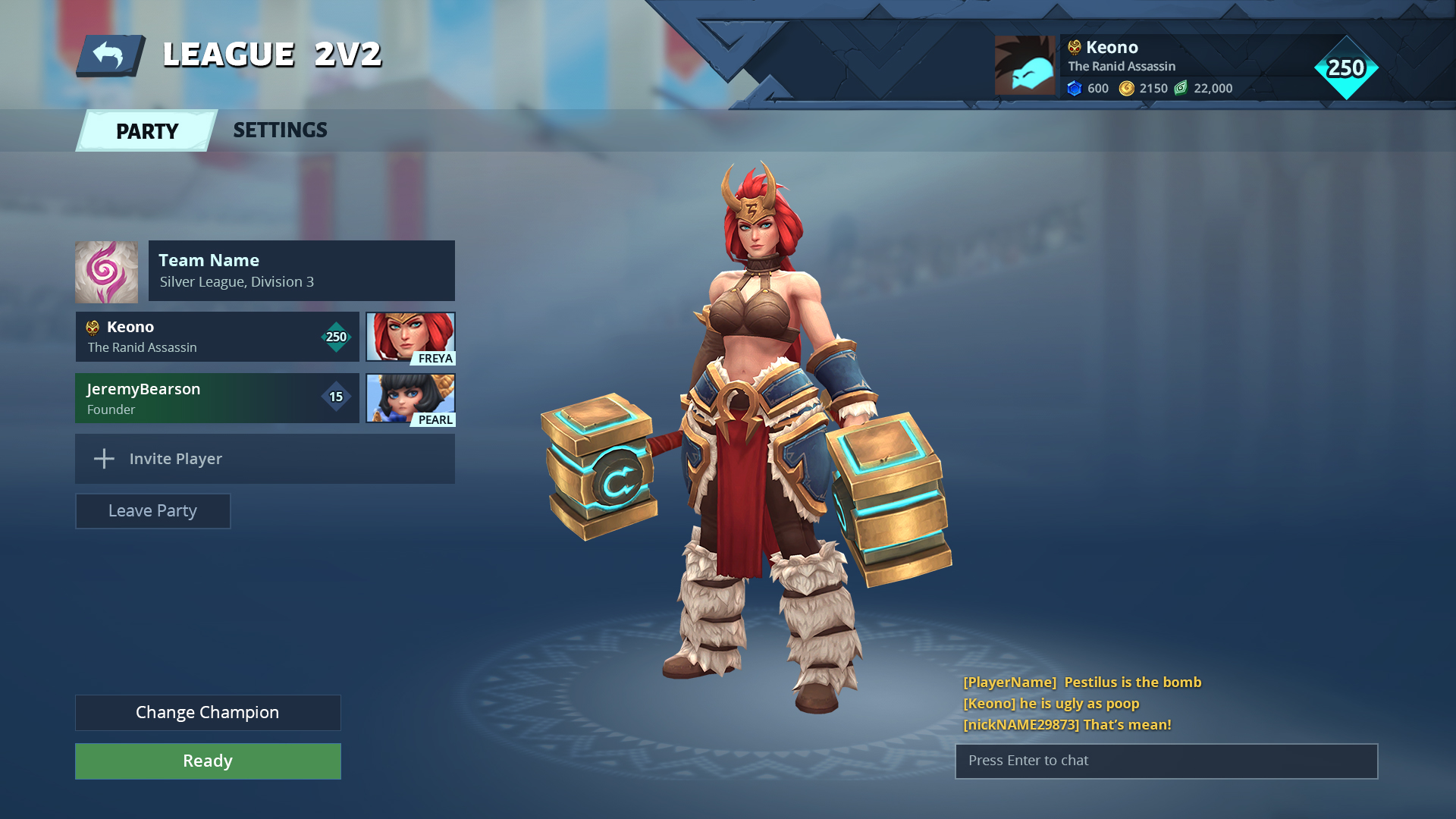
Progress on UI 2.0 continues and things are ever closer to getting into place. Katey shared this screenshot with me:

In here, they are exploring how the player slots beneath a team should be handled, in order to present it in a good and scalable manner. Katey feels like they’ve found a good spot in the above example where everything is visually easy to understand and it’s clear that the players belong to the team. The visual element of the slots should now be ready for the artists to step in and make them look more exciting.
Besides that, the UI team are working on a lot of things. In terms of tech, they’ve been finalizing the systems behind the pre-match system we want to get into place (which, if it’s unclear, means choosing or changing a champion after finding a match). A lot of art styling is also going on, with Katey and the artists redesigning the league icons and the Battlerite cards. They are also looking at the hover states of buttons and boxes, working on upping the visuals of the reward screen, and improving the presentation of when you rank up. Finally, time is also going into the chests to make them feel more engaging, both when browsing and opening them, to replace the slightly gloomy mood that surrounds the chests right now.
Before we leave UI 2.0, here’s also a sneak peek on the new league icons being worked on:

Closing Words & Tagline Winners
That’s it for this week. Do continue to stay tuned though as more news will be coming during September!
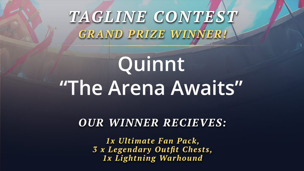
Before we end it though, we recently announced a tagline contest for Battlerite. We got tons entries and a lot of really good ones so it was tough to cut them down to our winners, but we somehow managed to do it. Here they are:
Congratulations to all of the winners!
And as usual, thanks for reading.
/Christian

